Here is my awesome new website
Filter blog
What is Net Neutrality?
“The idea is that a maximally useful public information network aspires to treat all content, sites, and platforms equally.”
[http://www.digitaltrends.com/web/net-neutrality-timeline/2/#definition]
- The FCC (vote was 3-2 for net neutrality regulations. These new regulations do not allow companies to purchase faster access to consumers through “fast lanes”. This law was voted on February 26, 2015. With this vote the FCC received big praise from President Obama.
[http://circanews.com/news/legal-challenges-to-net-neutrality]
- Consumers are concerned that the new net neutrality regulations will raise yearly bills by $84. The big telecommunication and cellular companies are opposed for the simple reason that they are losing the fast access to consumers that they use to have.
[http://circanews.com/news/legal-challenges-to-net-neutrality]
- The main point of passing this net neutrality law so that Internet access will be regulated like a public utility. These regulations will also apply to wireless networks that power cell phones as well as the broadband connections. Network neutrality is the idea that Internet service providers (ISPs) should treat all Internet traffic equally.
[http://www.vox.com/2015/2/26/8115361/fcc-net-neutrality-approved]
- “Today’s FCC decision will protect innovation and create a level playing field for the next generation of entrepreneurs — and it wouldn’t have happened without Americans like you,” Obama
- The FCC sees it as there being a referee for the internet.
“Internet providers such as Comcast and Verizon from slowing or blocking Web traffic or from creating Internet fast lanes that content providers such as Netflix must pay for.”
- Ajit Pai, said “the new rules are unpredictable. That could make Internet providers less willing to come up with new services.” Which is a huge negative for the internet. You could also see huge lawsuits in the future.
[http://www.nytimes.com/aponline/2015/03/03/technology/ap-us-tec-wireless-show-net-neutrality-defense.html?_r=0]
- “Too important to let broadband providers be the ones making the rules” by Mr. Wheeler
[http://www.nytimes.com/2015/02/27/technology/net-neutrality-fcc-vote-internet-utility.html]
- Net Neutrality: The principle that Internet services should enable access to all the content and applications regardless of the source, and without favoring or blocking particular products or websites.
- “Net Neutrality is the Internet’s guiding principle: It preserves our right to communicate freely online. This is the definition of an open internet.”
[http://www.savetheinternet.com/net-neutrality-what-you-need-know-now]
- A plan was released that was going to allow companies to “discriminate online and create pay-to-play fast lanes.” In response to this, millions freaked out about the plan causing them to shelf in it and give Internet users the strongest protections possible. According to an article on Free Press, FCC approved Wheeler’s proposal on Feb. 26, 2015. [http://www.savetheinternet.com/net-neutrality-what-you-need-know-now
- What you need to know about the new FCC’s new net neutrality proposal.

Reading Images A different way
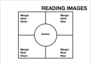
In the beginning of this reading, we are given an example of composition in an image and what composition means. Composition as a whole is when the representational and interactive elements are made to relate to each other, the way they are integrated into a meaningful whole. The example we are given is Minus and Karin and how they are placed because the placement of the elements endows them with specific information values relative to each other. Also Karin is the most Salient because she the most eye-catching element in the composition because she forms the largest, simplest elements in the picture, but she is the sharper focus too. Now there are three interrelated systems in composition. They are Information value, Salience, and Framing. First information value is the placement of elements that endows them with specific informational values attached to the various “zones” of the image left or right, top or bottom, centre and margin. Then there is Salience which is the elements are made to attract the viewer’s attention to different degrees, as realized by such factors as placement in the foreground or background, relative size, contrast in tonal value, differences in sharpness. Last is framing and that is the presence or absence of framing devices disconnects or connects elements of the image, signifying that they belong or do not belong together in some sense. These three elements of composition don’t just apply to pictures but they also apply to composite visuals, which combine text and images.
Placing things on the left or the right is a key factor. When stuff is placed on the left side is generally known as the GIVEN, and the stuff placed on the right is known as the NEW. “For something to be Given means that it is presented as something the viewer already knows as a familiar and agreed upon point of departure for the message. For something to be New means that it is presented as something which is not yet known, or perhaps not yet agreed upon by the viewer, hence something to which the viewer must pay special attention.” The concepts of Given and New are also applied to diagrams like in Shannon and Weavers communication model, and it also can be in film and television. As a result for the Given and the New is that a New can always become a given because it will become the Given for the next New.
There is also the information value of Top and Bottom. The top is represented as the IDEAL which means that it is presented as the idealized or generalized essence of the information, hence also as its ostensibly most salient part. The REAL is then opposed to this in that it presents more specific information. Just like the Given and New, the Ideal and Real can be used in composition not just in images but also composite text such as layouts.
There are many cultures out there that use these concepts of given, new, top, and bottom differently. Rembrandt used lighting as a way to express the meanings. The Given for Rembrandt was “Light” and the New was “Darkness”. There were many other ways people used these concepts throughout time.
For Centre and Margin are another key way of expressing compositions in images. If an element is central it is known as Centre which means that it is presented as the nucleus of the information to which all the other elements are in some sense subservient. Margins are so similar to each other that there is not a division between them.
Salience is so important to the composition because it can create a hierarchy of importance among the elements, selecting some as more important, more worthy of attention than others. With Rhythm being a huge factor for salience it is also big for framing too. For framing it is present as a separate unit of information. It stress group identity and the presence of individuality and differentiation.
B3 Passion for Music
Michael Foucault “Discourage on Language”
 “I am supposing that in every society the production of discourse is at once controlled, selected, organized and redistributed according to a certain number of procedures, whose role is ponderous, awesome materiality.”
Michael Foucault, a french philosopher wrote the book, “The Archaeology of Knowledge and The Discourse on Language“, in 1969. Foucault talks about the discourse of language through a theory about finding the truth and how knowledge is formed. He loved to study historical language because he wanted to find out how knowledge is in the truth. Foucault defined discourse by focusing on power relationships in society as expressed through language and practices. He goes through different time periods to find the truth out, such as the Middle Ages. Foucault wants to find out how knowledge and truth are formed by whom said it and in what context they said it in.
The rules of Exclusion was a huge stepping stone in his study with discourse. These rules consist of prohibited, reason and folly, and true and false. First prohibited rule says that we are not free to just say anything, that we cannot simply speak of anything, when we like or where we like. There are three prohibitions and they are, sobering objects, rituals with its surrounding circumstances, the privileged or exclusive right to speak of a particular subject. Foucault says that these areas are where the web is tightly woven because its where the danger spots are most numerous dealing with politics and sexuality. This next principle of exclusion is a division and a rejection in reason and folly. This is about what makes senses and then what doesn’t even be considered. From the Middle Ages, a man would speak and it would either be taken into consideration his words or they would just be ignored because they had no significance or truth to it. The last principle of exclusion is true and false opposition. Foucault discusses this discourse about truth and how people need the will of truth. Over the years through Hesiod and Plato a new division has came about and instead of the will to truth, it has become our will to knowledge. Foucault ends with saying,” I now know which voice it was I would have wished for, proceeding me, supporting me, inviting me to speak and lodging within my own speech.” He finally found this discourse of language he liked and wanted to speak about.
Infographic
Chapters 4-7
Chapter four is all about layouts and how the designer should make their layouts. A layout should provide a direction to the viewer that is very specific. A good layout should have a very clear understanding of their information for the viewers to see within the design. A clear hierarchy has some elements to it that helps the designer’s layouts much better, such as a visual contrast. A visual contrast has a couple principles that are must needed as in size, value, weight, white space, position, figure/ground, texture, and color. Then there is symmetrical and asymmetrical balance. Asymmetrical layout is when the arrangements on the design are mirrored and basically the same, but for an asymmetrical layout is when the layout is less predictable and much more dynamic. There is also sequencing or visual rhythm. These to things are achieved in a design by moving elements in different places and not having them in the expected areas or even eliminating some of the elements. Then there is depth, which in a design has, three-dimensional. Those three dimensions are scale, layering, and foreground/background. Last element is implied space, which is a very dramatic device in graphics. The implied space is the part of the design in which the area the designer reference beyond the actual page.
All designers need to sketch before they design their graphics because it puts ideas on paper and it helps with new ideas too. There are seven steps the designer needs to do with sketching before they start designing. Also when doing a design the designer has to consider the types of online designs out there. The designer needs to look at the site architecture because that’s the key success for the graphic for many of ways because the users can go forwards, backwards, in, and with a good architecture of the site will be the key to success. There is also the browser compatibility in which the users computer can change the look of the and functionality of the website and good designers know when to check it and recheck it so nothing bad happens. The html is the “scripting language” because it proves everything the viewer can see on the website. One of the last things is on-screen contrast and readability and a designer needs to review their project in black and white and then adjust their work so that the proper contrast and size is readable for the viewers.
Book chapters 1-3
Chapter one starts off by going over research strategies that will help a researcher and designer with a graphic design they are trying to do. First they should always answer the question who? What? Where? When? Why? How? This will help reveal what the designer is trying to put out there about what they are trying to sell or do. Then you want to find examples of what your clients are trying to find out there and compare them to yours. Third thing is to create a typical scenario. This will include writing a hypothetical story about a fake customer that gives them a profile, motivation, price points, and scope information for the designer and customer to understand the goals of the graphic design.
Chapter two is all about typography of design. It is the building block of graphic design. There are many types of designed used in the graphic designs including old style, transitional, modern, and digital. For old style the letters are angled and chisel point tools are used to paint and draw the letters. For Transitional letters they are serifed and cleaner look to the letters because they are more manufactured look. Modern design was a cleaner and the use of visually even strokes and a machine look for the letters. For the last one digital the desktop computer programs allow designers to use all types of typographic designs for the letters. The typeface technology has some terms that help with the design and they are Point size and z-height, leading, tracking, line length, and alignments. The point size is measured from the top of the ascender to the bottom of the descender. The x-height is where the majority of the reading takes place. The leading is the space between lines. Tracking is when the designer customizes the space between letters. The line length is said to have 39-45 letters because then the user will fatigue and stop reading. Last are alignments. There are many different alignments such as flush left, flush right, centered, justified, and free form. They all have different uses to them so the designer can choose which one fits his or hers design. Designers want to combine typefaces because it will make the design much better and more unique to the customers other than just one plane typeface.
Chapter three talks about contrast and what it does for the design. Without contrast the design usually isn’t interesting at all because it’s so dull. Using contrast will help the design communicate a clear and useful hierarchy. Contrast is the key to a successful design. Color is one of the ways contrast can help out a design because the color communicates with clients. Mixing colors can show different impressions to the clients. The designer should have fun using contrast but just make sure that you are within reason of having fun.
Professional Business Card
For my Professional card I put a lacrosse guy shooting on the front to show what I do and in clear lettering I put exactly what my profession is so people see it right away. I put my name in the varsity lettering again to give it some style.
For the back I put a quote that I try to make people really think about and put it in the varsity regular font and then I put my information in regular font so its easy for people.
Personal Business Card
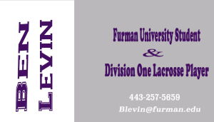
For the front of my Personal Business card I used Varsity regular font for my name and standard Copper black font for what I do. I also went with a grey and white base to make my name and information pop out.
For the back of this card, I went with the diamond F for Furman and changed the inside to white to make it stand out better and also make the background grey.


